The need
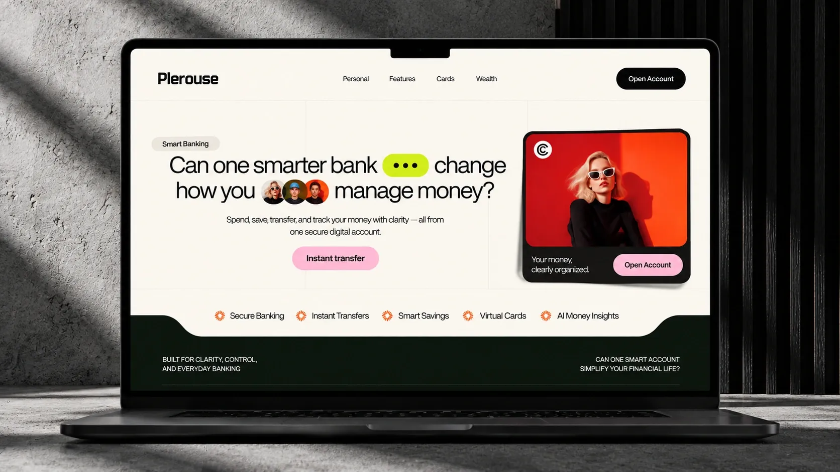
Plerouse is a concept, not a real client. The idea: imagine the homepage of an online bank that stands out from the usual banking sites, often cold and cluttered, without losing the clarity and trust people expect when money is involved.
What was done
- Bold typography, with large headlines that ask a question
- Strong contrast between a light background, deep green and touches of pink and bright yellow
- A modular grid that keeps every piece of information readable and in its place
- Versions designed for desktop, tablet and phone
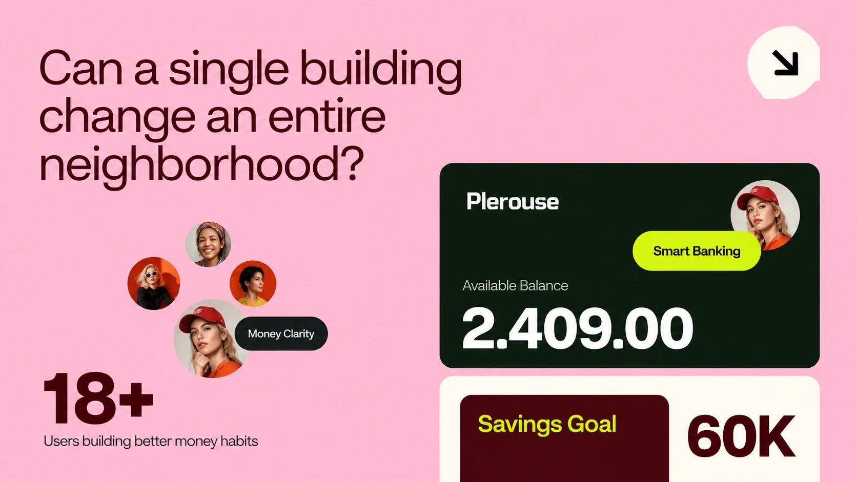
The information blocks, up close 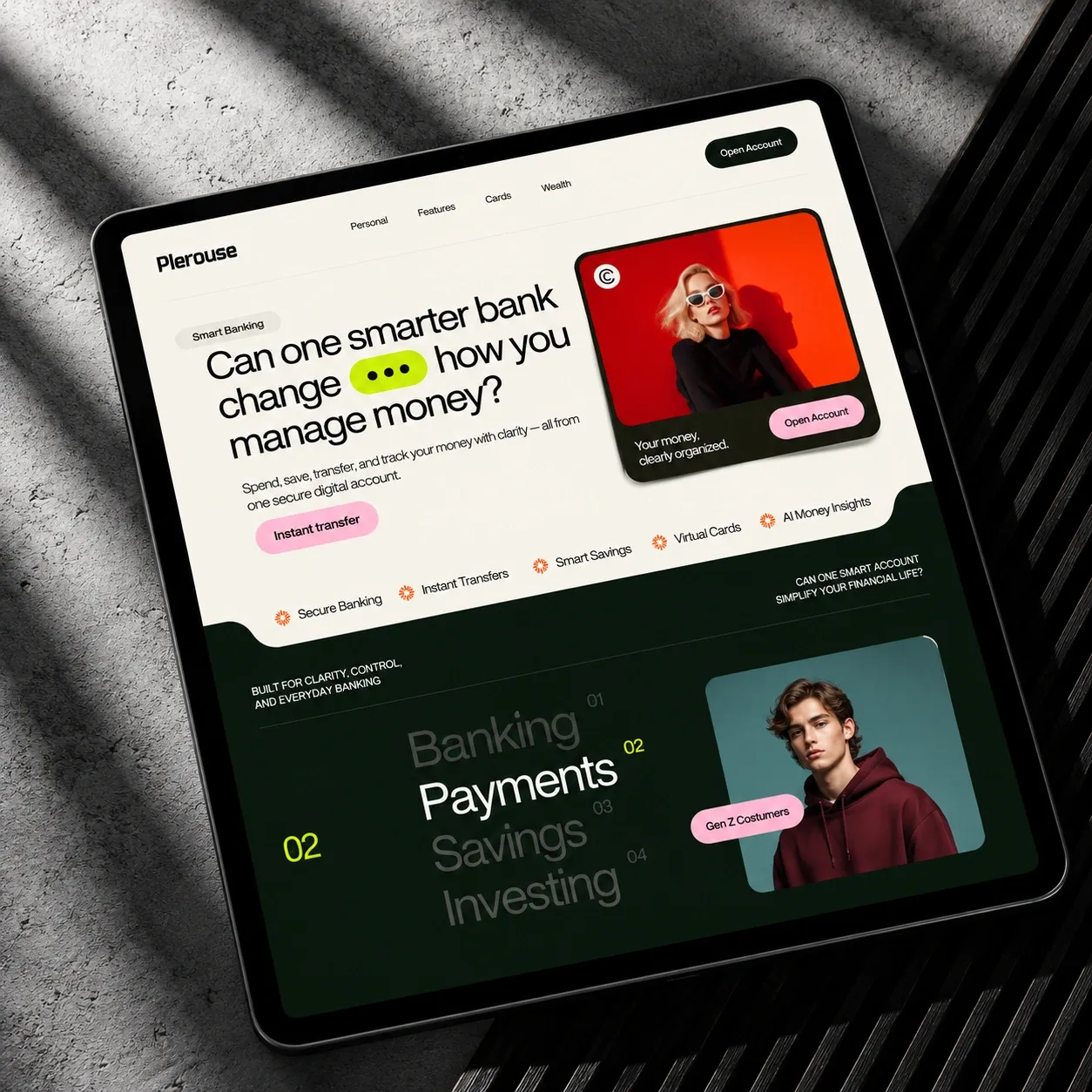
The page on a tablet 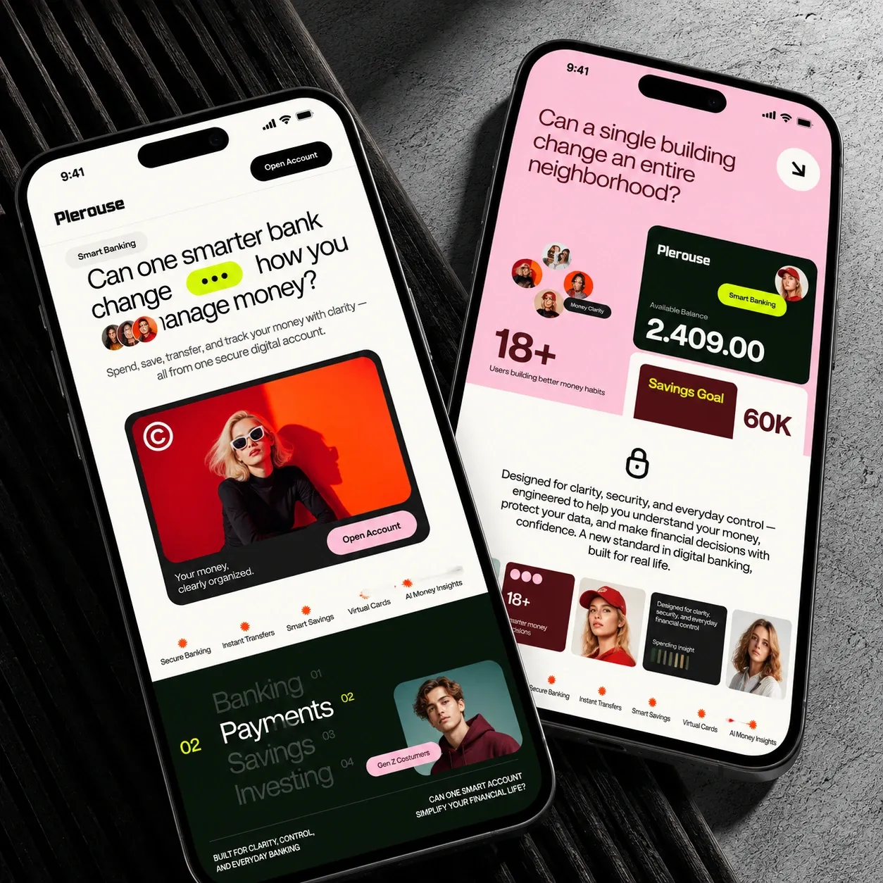
The phone version