The need
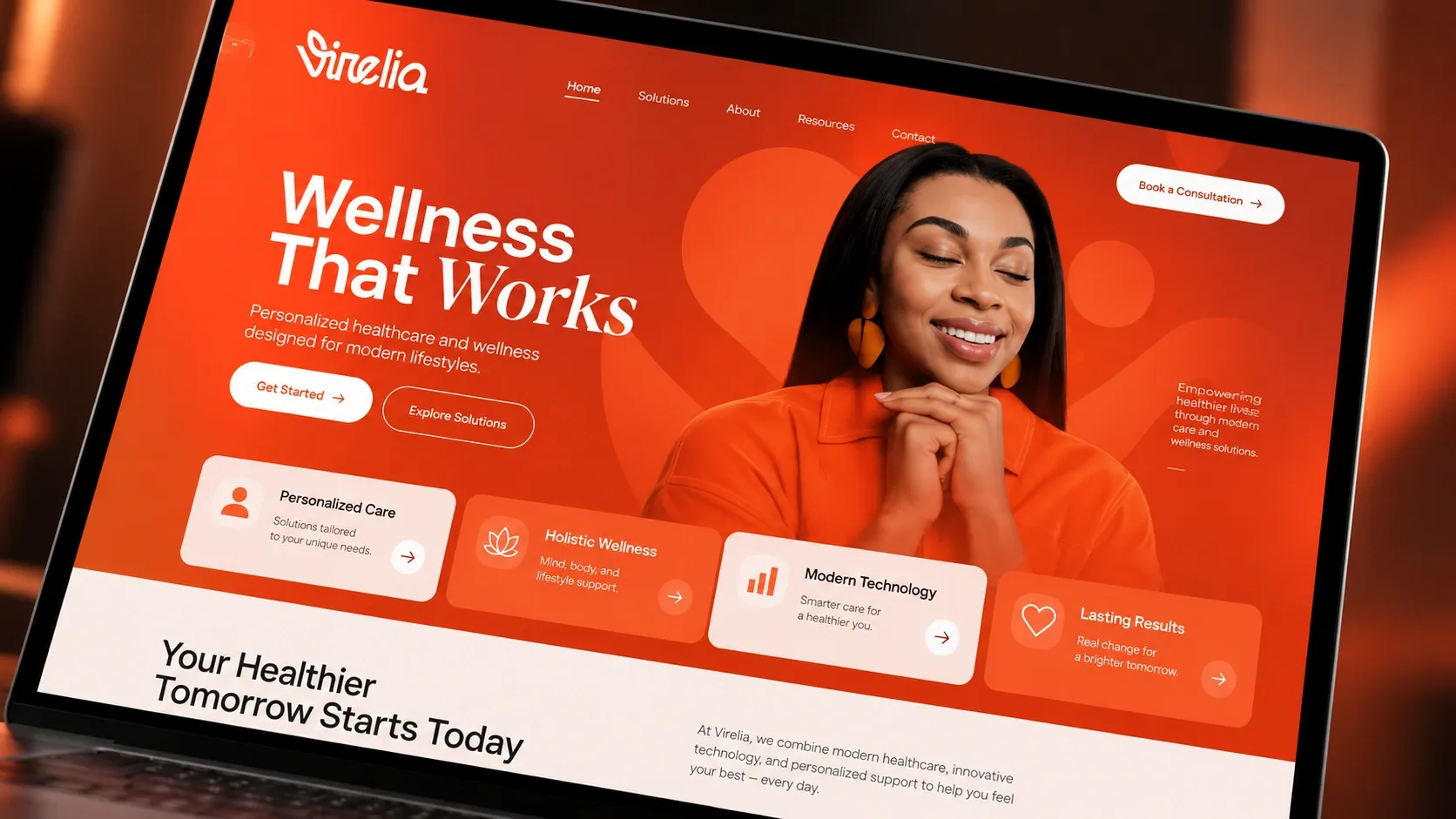
In health and wellness, many brands look alike: pastel tones, cold images, vague messages. The idea was to create a warm, confident brand that people recognize at first glance and trust, on a screen as much as on the street.
What was done
- A logo with a soft, personal stroke, plus a monogram for small formats
- A bright orange signature color, softened by a warm cream
- Clean typography, with a touch of italics for the words that matter
- A symbol shaped like a figure with raised arms, used as a background on every piece
- Brand guidelines to keep the same look everywhere
- The brand applied to the website, business cards, poster and shop sign
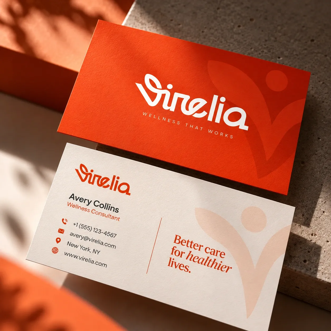
Business cards 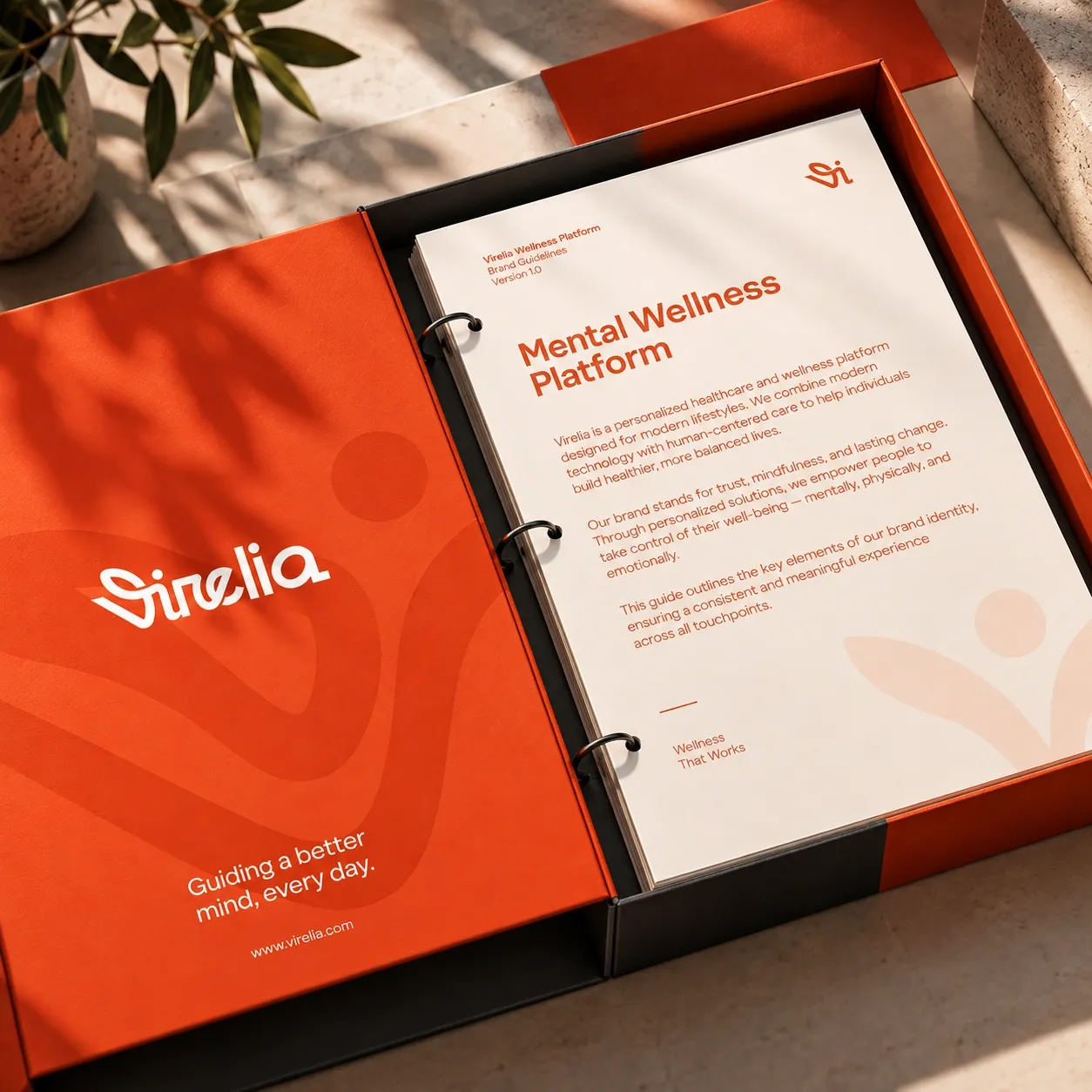
Brand guidelines 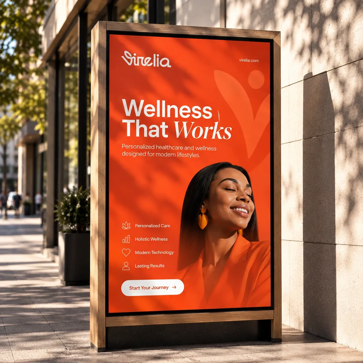
Poster 
Shop sign