The need
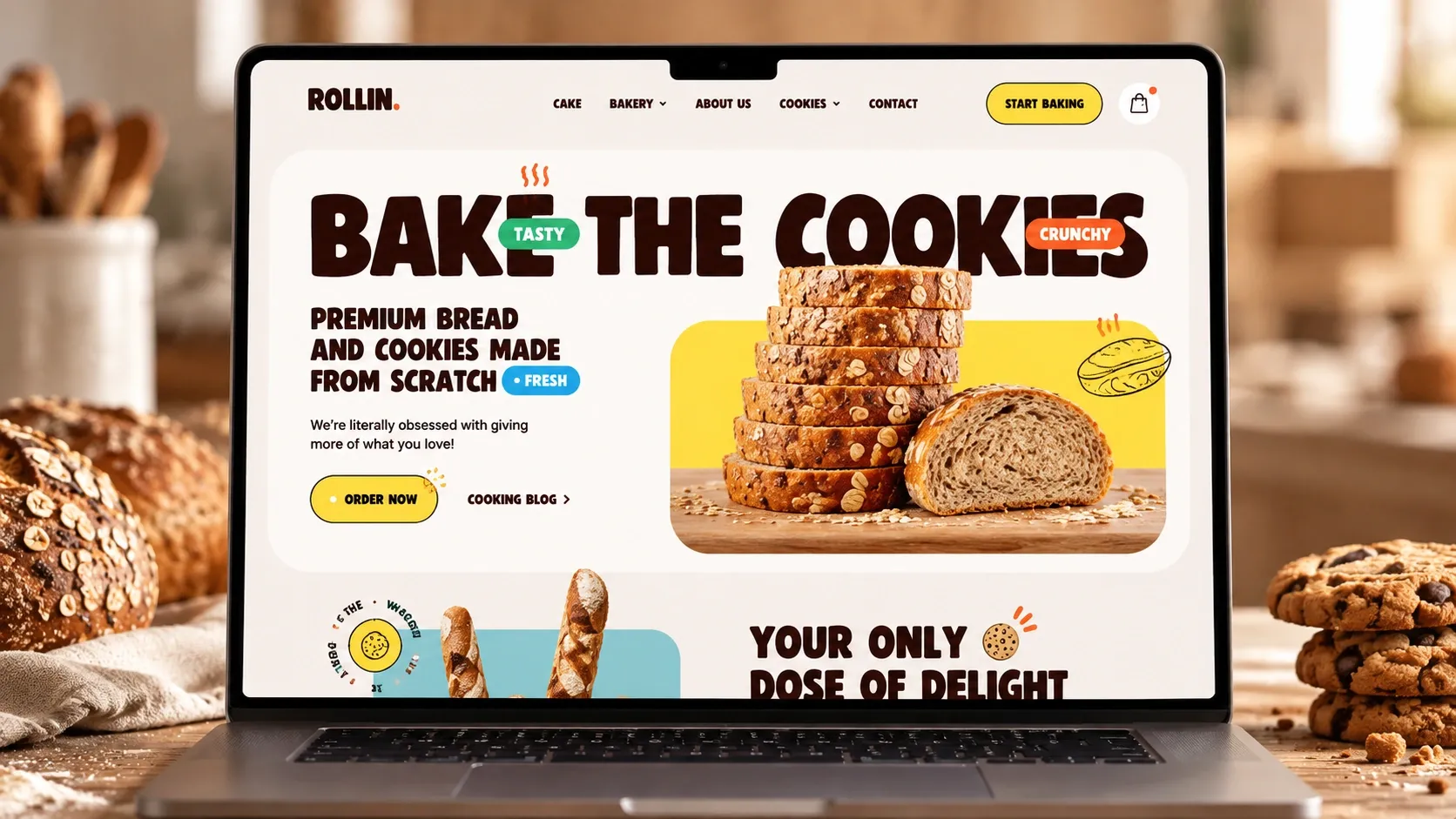
Many bakeries have an outdated website, or none at all, while their customers search on Google before walking through the door. The idea was to create a cheerful, tasty brand that people recognize on a cup as much as on a screen, and a website that makes them want to order.
What was done
- A logo in round, generous letters, with an orange dot as a signature
- A warm palette of yellow, orange and light blue on a cream background
- Small hand-drawn illustrations, cookies, croissants and baguettes, used on every piece
- The brand applied to cups and packaging
- A website that puts the products first, with prices and an order button
- Pages and text written to be found on Google
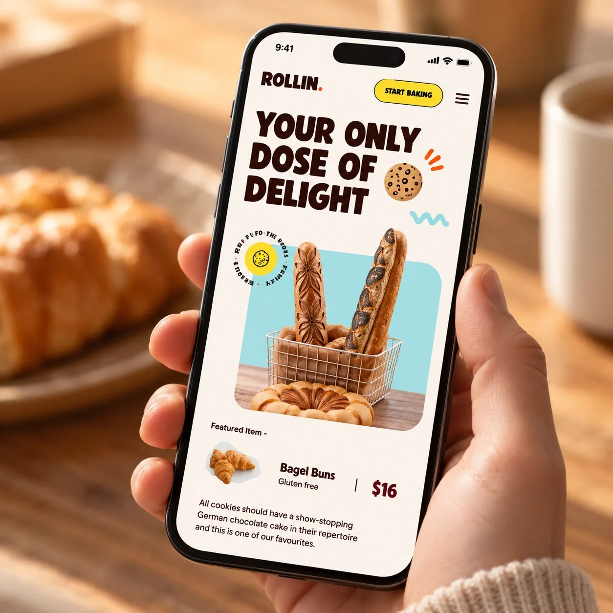
The phone version 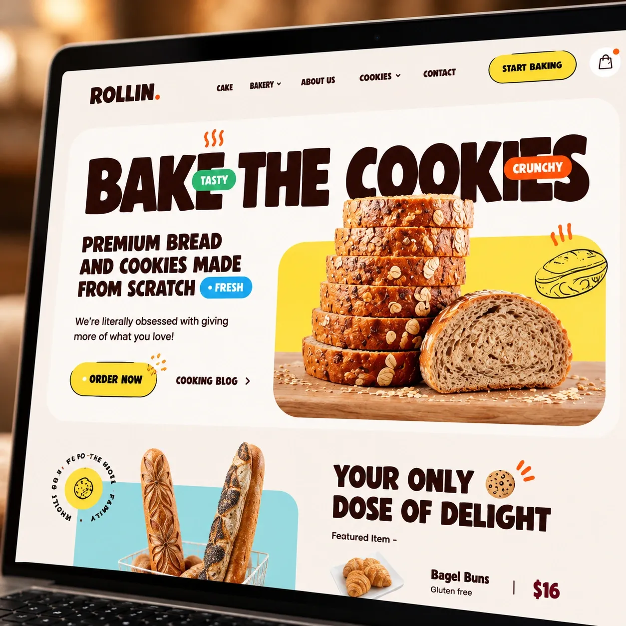
The homepage, up close 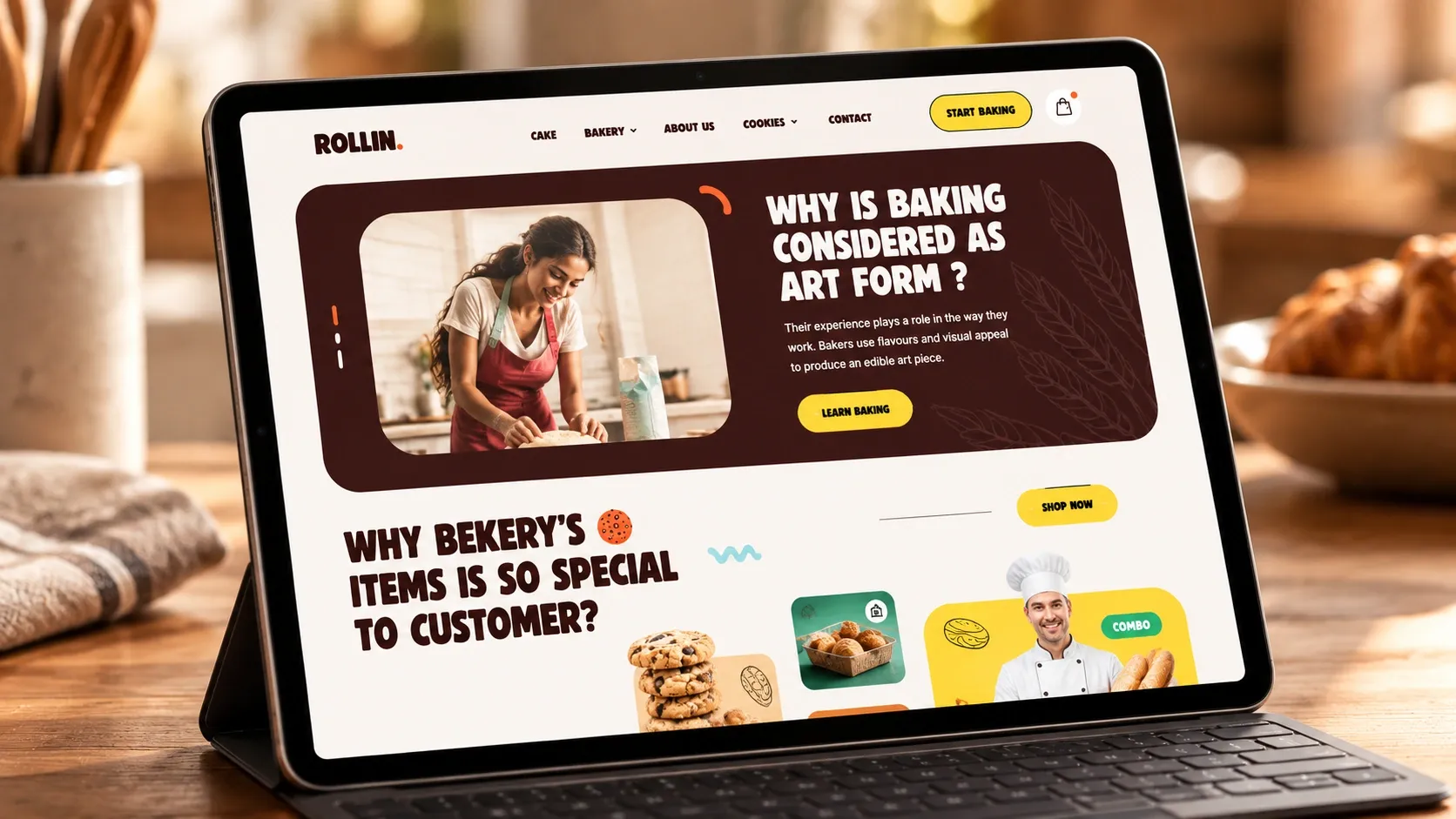
The bakery's craft, on a tablet